Sunday 28 August 2011

Thinking about Type

Manipulating spatial data and visual variables, such as colour and spacing, tend to take up most of my time when I make a map.  But increasingly I've been exploring typeface and using type to convey more information about the data or map that you are creating.  Traditional cartography uses italics to name natural features such as rivers while man made features are in normal font.

This video talks about the use of typeface to convey messages in logos and signage.  Presented from a design perspective, it should spark some cartographic ideas...


Monday 15 August 2011

Installing ArcGIS on a Mac

Have a Mac and want to install ArcGIS? Some helpful folks have developed a how to guide - available at http://www.esricanada.com/k12_docs/BP_ArcGIS_on_Mac.pdf

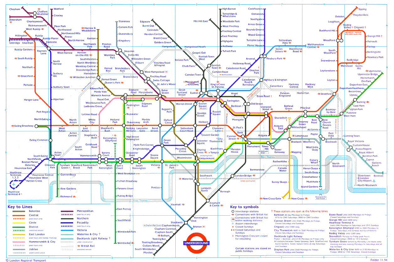
The London Underground

I thoroughly enjoy giving my undergraduate cartography lectures and talking about the design of the London underground map is a highlight.  Students who have and haven't been to London and used the map have very different impressions of it.  (Mostly positive if they've used it - by the way!)

However, it looks like it might be up for a redesign...


The Independent have just run a story on a potential redesign and have mentioned a lot of the comments that are brought up in class by previous users of the map half a world away. 

Yes, it does cause you to have a rather warped view of the actual London landscape - and I've fallen for the two tubes and multiple stations rather than a five minute walk alternative because I wasn't quite sure where I was.  However, there's something particularly liberating in that lack of geographic context for a geographer!  And many areas in London are easily navigable.

So which is better?  The old 'diagram', straight line map or the new more topographically accurate one?


Thursday 11 August 2011

Colour and how you perceive it


Colour is always an interesting topic for those interested in the visual communication of information. Cartography in particular relies on colour (hue, chroma and lightness) to relay information to its audience.  A colleague of mine pointed me to this BBC programme on the perception of colour - how its affected by your moods, your use of descriptions, your language, etc.