Friday 30 May 2014
Thursday 29 May 2014
Wednesday 28 May 2014
Aggregate-disser: overcoming the problems of aggregate data?
This post by Brandon Martin-Anderson details a way to disaggregate spatial data - for example, census data is normally provided at an administrative level like meshblock in NZ or census tracts in the USA but this may not appropriately represent the underlying data.

The aim of disaggregating the data is to estimate the underlying distribution of the data which has been aggregated. For example, locations of households rather than the total number of households in a meshblock. The tool proposed is Java based and can produce a CSV (comma delimited file).
Worth a look if you're interested in using alternative ways of visualising your data - but be careful - it can seem more accurate than it actually is!
Tuesday 27 May 2014
An ESRI Story map showing the locations of different Scottish distilleries and sorting by single malt characteristics
I'm not a great proponent of story maps (they seem a little over hyped to me) but I thought the idea behind this Scottish Whisky map was neat - get it?? :)
Monday 26 May 2014
Michelle Boodee: Summer Scholarship with the School of Geography, Environment and Earth Sciences at Victoria University of Wellington and Spatial IQ

Over the summer of 2013-2014, I received a Summer Research Scholarship with Victoria University of Wellington - VUW - and Spatial.IQ. The scholarship funded my work on a project to develop a set of usability heuristics for New Zealand local government web mapping applications. My time was split between the GIS lab at VUW and the Spatial IQ offices in the Botanic Gardens in Kelburn. I worked in collaboration with Mark Shaw (Director at Spatial.IQ) and Mairead de Roiste (Senior Lecturer of GIS at VUW).
The main aim of my summer’s project was to create a set of usability heuristics based on professional experience and a review of geospatial and general web usability literatures. The heuristics needed to cover each component of a web mapping application - accessibility (findability), the map itself, the functions of the application, its performance and overall user experience. I then evaluated local government websites across New Zealand and scored each local council’s web maps according to these heuristics based on three different use cases of varying degrees of complexity.
Evaluating the usability of local government web maps is a new extension of Spatial.IQ’s What’s My Spatial.IQ? project. What’s My Spatial.IQ looks at local government web mapping, the technology behind the mapping, and the usability of those mapping applications. By using a robust set of usability heuristics to determine the quality of local government web mapping applications, we can garner an understanding of the overall quality of local government web mapping in New Zealand in order to provide a starting point for improving the standard and value of local government map-based information provision.
The GIS powerhouse that is Duane Wilkins...
Ok, it may just be that I adore the song accompanying this video but I had to share this. Its one of the overview of all things GIS Duane Wilkins produces in his now infamous (at least in the NZ GIS community) videos. VUW GIS students are extremely lucky to have Duane come in nearly every year to share his views on GIS and his rather incredible work history (Crown Forestry Rental Trust, Iraq, Department of Conservation, Project Management for Maori GIS projects, the list goes on...).
Friday 23 May 2014
Thursday 22 May 2014

Wednesday 21 May 2014
QGIS tutorials
Some rather nice looking QGIS (an open source and free GIS software) video tutorials - available from Mango maps at: http://qgis-tutorials.mangomap.com/post/79334660226/qgis-video-tutorials-module-1-the-interface
GED Seminar: Accessibility, commuting and the car ownership decision - Thursday 22 May 4-5pm Kelburn
GED Seminar Series
Accessibility, commuting and the car ownership decision
Thursday 22nd May, 4-5pm
Cotton Seminar Room 304
Victoria University of Wellington, Kelburn Campus
Abstract:
Rising fuel prices, costly transport infrastructure, congestion, external environmental impacts and impending peak oil difficulties highlight the importance of understanding the economic decisions behind commuting patterns. Where a person lives and works are important factors in an individual’s transport decision and are key determinants for car ownership. However these spatial factors are interlinked and an individual’s residential location is also determined by where they work and their transport choices among other factors. Households are also likely to compromise on their commuting, car ownership and residential choices according to the needs of multiple members of the household.
Based on the New Zealand household travel survey, this study asks the question of how residential and work locations, and by what means a person commutes affects the number of vehicles they own through a joint decision making process for individuals within a household. By calculating the accessibility to work over a geographic transport network of where a person lives as well as a large number of other residential alternatives, this study uses a discrete choice model to explore the extent to which these spatial factors influence car ownership of households. This study breaks new ground by developing first a joint decision model and second applying it to the three levels of that joint decision (car ownership, residential location and commuting strategy).
Speakers: Mairead de Roiste, Toby Daglish and Yigit Saglam
Tuesday 20 May 2014
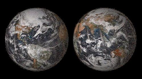
Love this: NASA space station live streaming in HD of Earth
Site also shows where the space station is over on a map to the right of the streaming video. I especially love the part of the space station that's visible!
Monday 19 May 2014
Nice video on the border between Canada and USA
http://www.npr.org/blogs/krulwich/2014/04/25/306535819/-don-t-touch-me-said-canada-i-won-t-said-the-usa-so-they-moved-20-feet-apart
Definitely worth breaking out the headphones for...
Definitely worth breaking out the headphones for...
Friday 16 May 2014
Gartner's Hype Cycle
While the post is primarily about location intelligence, there are also interesting points on the graph (especially re: Big Data).

Thursday 15 May 2014
Earthquakes this year to end of April in beautiful animation
Stunning animation of the earthquakes on the globe this year to the end of April
Wednesday 14 May 2014

Tuesday 13 May 2014
Open Addresses
I haven't used it yet, but seems like another great open data initiative. Open addresses - add to it or use for geocoding...
New Zealand's most deprived areas
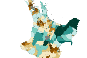
New Zealand Herald has posted an interactive map of deprivation in New Zealand using the latest deprivation index.
Thursday 8 May 2014
New Zealand Oil Spill Map
This rather neat visualization was produced by a Wellington based data science and data visualization company - Dumpark.
The map based data visualization produced for Greenpeace shows the potential spread of oil after a deep sea oil drilling well blow out.

[via Andrew Parnell]
The map based data visualization produced for Greenpeace shows the potential spread of oil after a deep sea oil drilling well blow out.
[via Andrew Parnell]
Subscribe to:
Posts (Atom)